Uplift Goals
How might we help students achieve fitness goals through consistent workout schedules?


How might we help students achieve fitness goals through consistent workout schedules?

Set a weekly fitness goal and track your progress to stay motivated.

Monitor long-term workout patterns to foster consistency in fitness.
Context & Problem
Launched in 2018 by Cornell AppDev, Uplift is Cornell’s all-in-one fitness APP with features to check Cornell’s gym hours, facilities, and fitness classes.


Current Screens of Uplift
However, Uplift faces challenges in retaining users due to the limitations of the APP’s static information, which people familiarize with over time. Therefore, uplift still needs more personalized features that engage users on a deeper level.
User Research Insights
To determine which personalization features would enhance Uplift's retention, I collected insights from interviews with gym-goers at Cornell to learn about problems they experience in fitness:

Packed schedules throughout the semester decrease motivation at busy times.

Uncertainties and emerging deadlines make workout inconsistent.
Students lack effective ways to measure completion of goals, so they easily forget or give up.
With these insights, I formulated a guiding question, shown in the heading below.
Design Solution
After thorough ideation and discussion, I identified Fitness Goals as an impactful feature space, with two sub-features that respectively address immediate engagement and long-term consistency.

To integrate this personalized feature into the existing app, I decided to introduce a separate 'Profile' tab, distinguishing it while preserving existing informational content. This case study focuses on how I designed the profile page and its goal-related features from scratch.

Iterations


The left-aligned option is more space efficient and more consistent with the alignment of existing screens in the app.
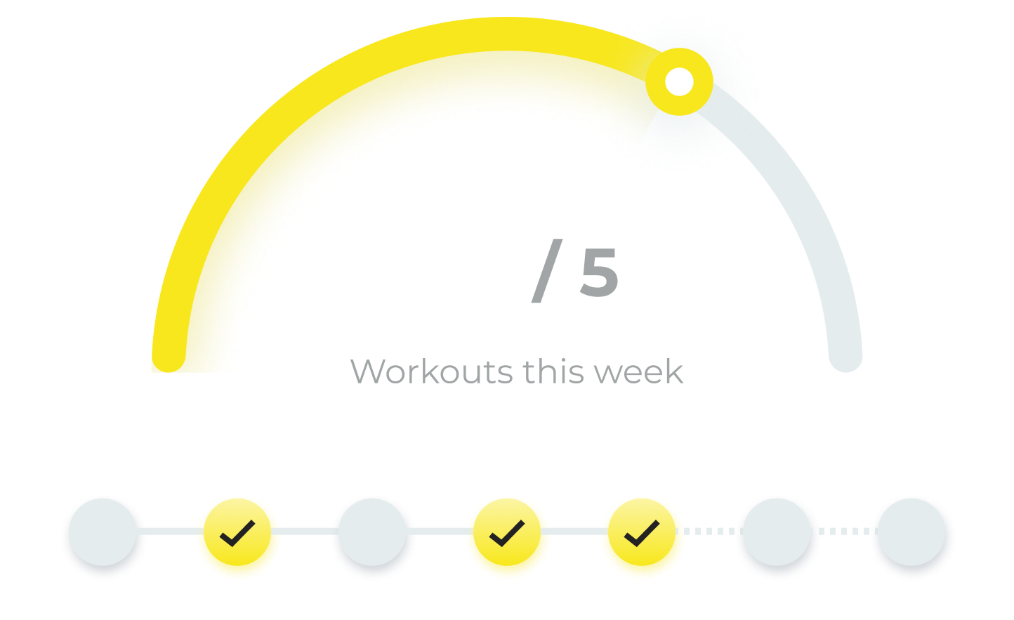
The profile page consists of a goal tracker to help users stay engaged with their fitness goals, and a history section to monitor long-term patterns and stay consistent. I emphasized the goal tracker by placing it in a centralized location to offer constant motivation.
The user will set a weekly target (no. of workout times) during onboarding or in a subpage, and the tracker allows users to monitor their progress to stay engaged with their own goals.
To introduce convenience and encourage students to utilize on-campus fitness resources, we plan on using fitness centers' data on student gym swipes to automatically update this progress tracker. This further sets us apart with our high on-campus integration as a student-facing app.
I explored three visual layouts for the tracker:


I decided on the semicircular tracker, which is both visually engaging while distinguishes clearly with existing ring designs we have for displaying gym capacities. Additionally, I added a color change to an orange gradient upon goal completion as celebration and offer encouragement.
Complementing the main progress tracker, the day tracker helps users to their workout arrangements and spacings to facilitate a healthy routine. The circle representing each day fills to indicate daily workout completion.


While checkmarks emphasize a sense of completion to offer motivation, replacing dates may not be accessible especially if the user checks off all days in the week. Thus, I made a revision by moving the dates outside to make sure that they're always visible.
Additionally, I used solid vs. dashed lines to offer visual cue that distinguishes past and upcoming dates:


By allowing users to track their monthly workout history, thiaims to foster long-term consistency in workout patterns. I explored two possible formats:


The monthly calendar view makes it easier to quickly identify long-term patterns in workout schedules. However, since there are limited space in the main profile section, I decided to reserve it for a separate sub-page and include a monthly overview on the main page to ensure clarity and prevent cluttering.
The overview displays key metrics to highlight monthly progress at a glance, and the most recent workout history entries to keep users motivated and informed about their activity.

I explored different visuals to display workout history entries in the overview, eventually deciding on the divider lines to balance between visual separation and fitting more entries in the limited space.


For the calendar, I explored visualizing each day as a filled checkbox versus using colored dots under each date to indicate workout completion.


I decided to go with the dots to reduce visual cluttering of the interface, while offering more flexibility for additional interactions such as hover states showing details that assist with habit awareness:

Final Design
Integrating weekly goals and monthly history, the new profile page of Uplift balances short-term motivation and long-term consistency to engage users along their fitness journeys.

Reflections
I learned a lot from this project as my first product design experience on Cornell AppDev, including mastering spacing standards and communicating with developers. I am extremely grateful to my co-designer and design lead for supporting me throughout this wonderful journey!
The addition of Goals would certainly help engage students in keeping up their fitness plans. Moving forward, we plan on conducting further user testing to gauge the usability of interactions in these features. We will also explore expanding these functionalities, such as infinite scrolling to the monthly calendar and workout categorization, which were not included due to scope limits.